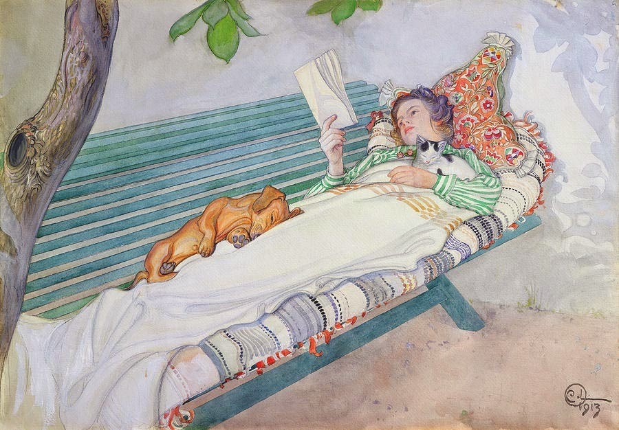
In this episode, colour helps jump start my capsule wardrobe design process. This one is all about lush, gorgeous, juicy and delicious colour that makes you want to bite into it. I feel another design brief coming on.
Amy’s amazing Twitter thread is here.
Wardrobe Architect post Series on the Colette blog. The specific post on finding colour inspiration is here.
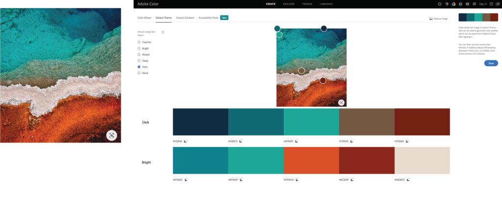
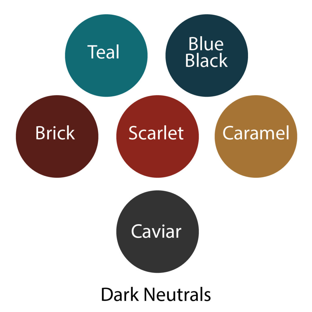
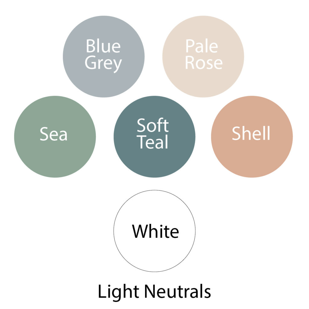
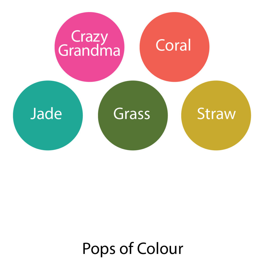
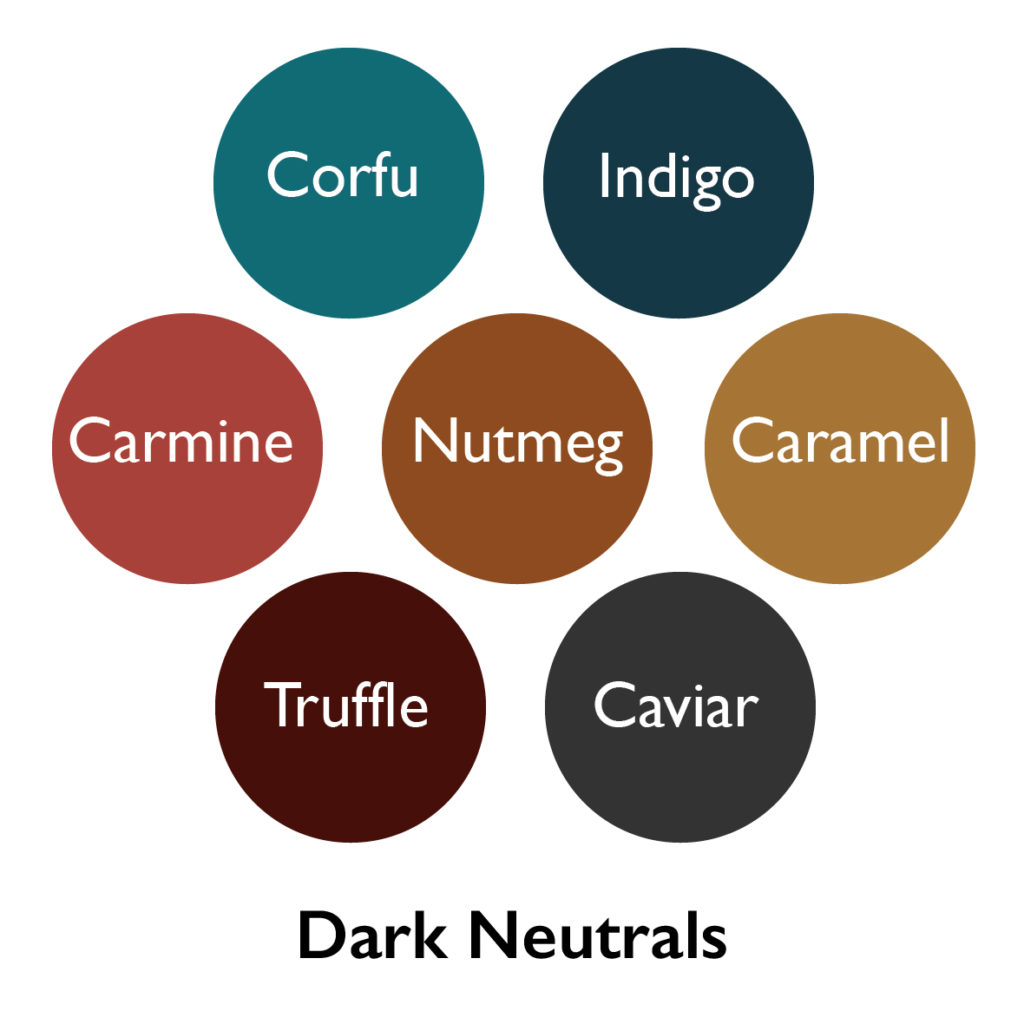
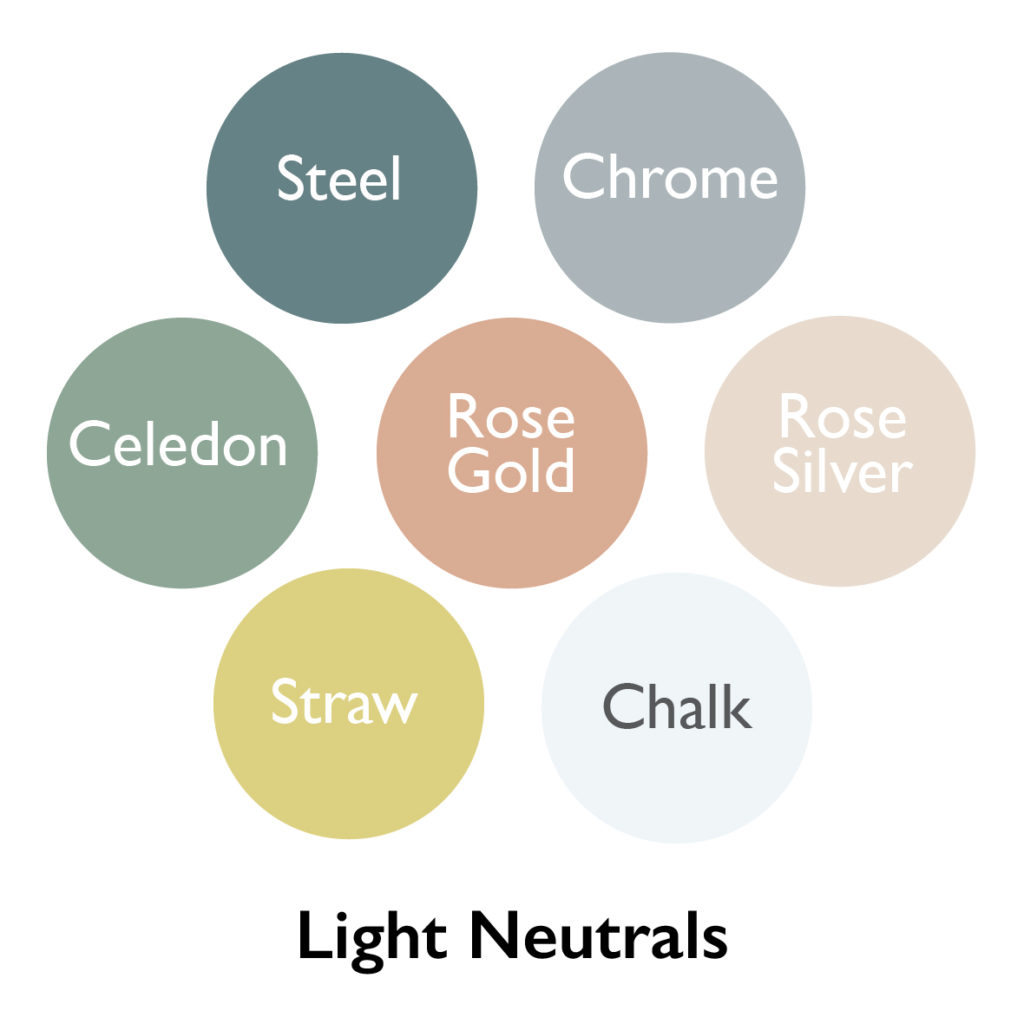
I used Adobe’s Color Theme from Image tool to create the original six palettes from my source images (below). It’s really fun. You should try it.
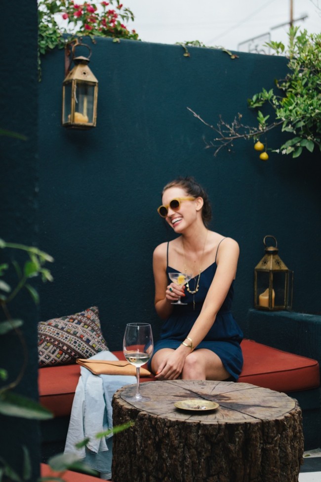
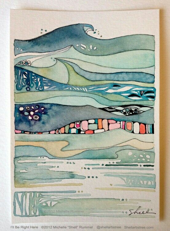
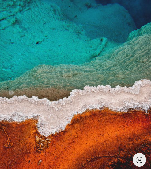
You’ve probably noticed how the source images are based on a variety of mostly blue and orange palettes. Unsurprisingly, Adobe’s algorithm noticed too.
If you like what you heard in this podcast, I hope you’ll consider becoming a Patron, or buying me a coffee.
Hi Brenda
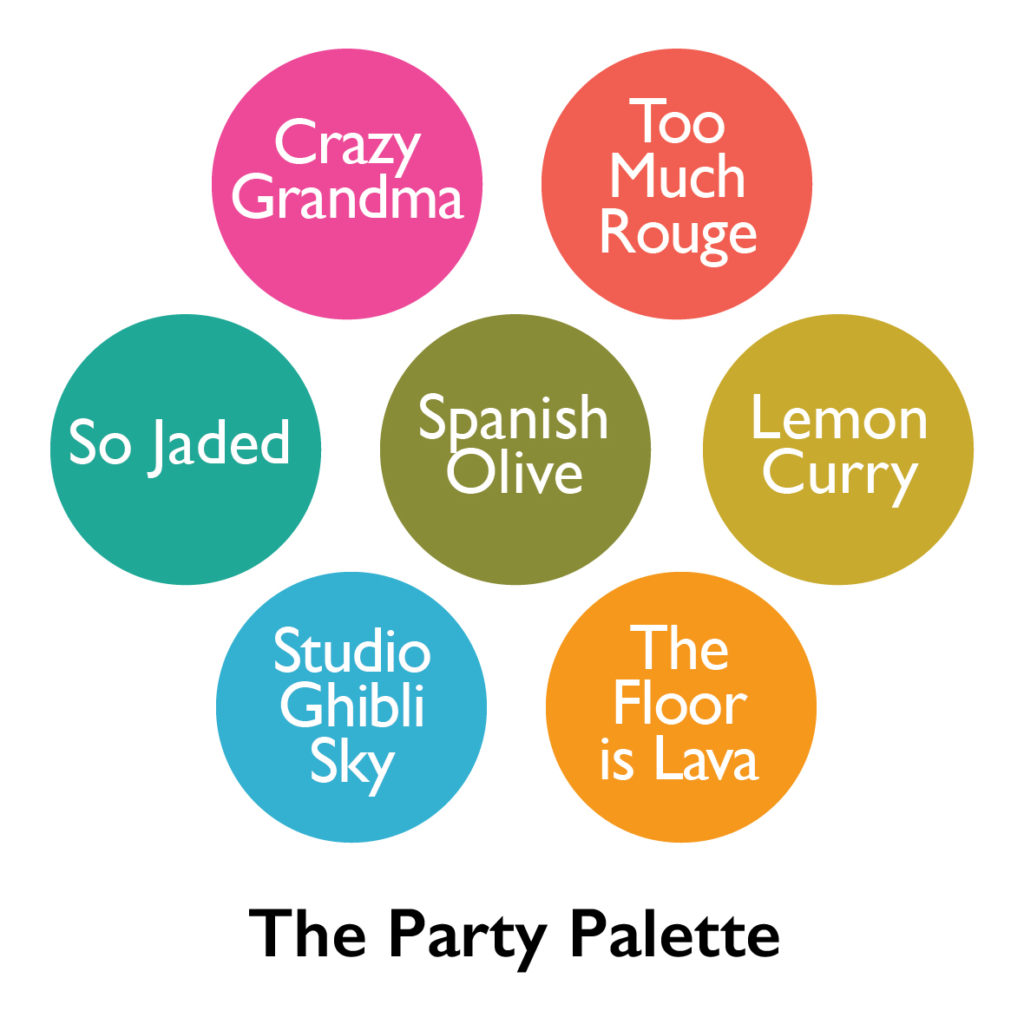
Great shoe on the colour pallets and your process. I think I have an indi dyer who may have your Ghibli colour https://blackwattleyarn.com.au/colours/
Thank you, Jane! The colourway “Vivid” is exactly what I’m looking for.
Hazel Knits in Seattle, WA has an enormous array of luscious colors.